LIVABILITY
Livability has run disability services across the UK for over 170 years. The charity in its current form was created ten years ago through a merger of the charities John Grooms and The Shaftesbury Society, when they adopted the name, Livability.
The research findings and brand narrative
We began the work with a research and strategy development programme, and quickly recognised two key drivers. The first was that Livability was in the midst of realigning its work to centre around communities – and that several of their flagship programmes were outstanding examples of this, offering people the opportunity to connect, contribute and be valued. The second was that, to go forward coherently, Livability needed to succinctly describe the problem it was tackling – which we identified as the social isolation faced by disabled people and marginalised communities.
We found that Livability was, and remains, a charity whose work spans a vast array of activity, from ‘traditional’ residential care, to community centres, churches and retreats – hosting a beautiful mix of services for an incredibly diverse customer base. So Livability posed an unusual challenge. How do you define an organisation whose very strength is that it is not just one thing – when its strategy is to design services around local community needs, whatever they may be? And that, in fact, was the point. Livability’s great strength is that it recognises that people facing social isolation are complex beings just like everyone else, and who above all needed to reconnect with the communities around them. The last thing a person that has become isolated needs is to be treated in isolation.
These insights were carried through into a comprehensive communications and fundraising programme. This first defined Livability’s values, then framed an extensive piece of audience research to understand the things that both divide and unite communities, and that make live livable.
We followed this with an audience segmentation and brand strategy that worked to mix national-level engagement with mobilising local volunteer groups, connected to local services.
The next task, which brought in branding specialists Johnson Banks, was to find a way to bring these ideas to life, and collaborate on a coherent narrative and a new visual approach. Conversations began immediately, asking ‘what makes a life livable?’, and equally, ‘what makes it unlivable?’.
A key issue was exactly how to define ‘community’ – and this ultimately led to the brand’s final narrative. Because what makes life livable is never down to just one thing – it’s the sum of many things: from friendship, to fun; from companionship to community; from a great chat to a challenge overcome.
The design approach
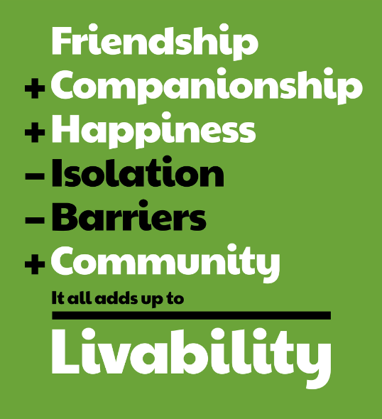
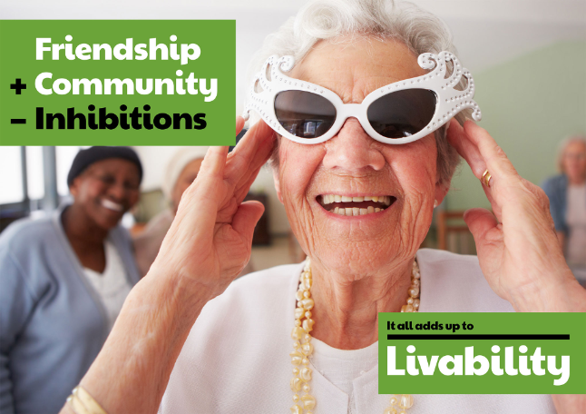
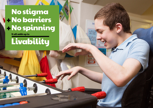
This idea of a ‘sum of many things’ in turn inspired a verbal and visual approach which borrows the language of mathematics to demonstrate with words, pictures and symbols how ‘it all adds up’. The brand toolkit includes multiple ‘sums’ which can be used to constantly re- inforce Livability’s new stance, and end with a clear line under which Livability’s new logo always appears. Most of these sums are positive, by their very nature, but there is flexibility in the scheme to show how removing stigma and ignorance is still an issue for disabled people.

A UK-wide photo-shoot by renowned reportage photographer Nancy Honey is another key element of the new brand. From tea-dances to pottery lessons, table football to tea and biscuits, the young and old are all portrayed as equally – and as positively – as possible.
An ever-present challenge for the redesign was to ensure that, for a disability charity, all the elements involved had to be as accessible as possible. This meant extensive testing of colours, their contrast and legibility, online and off. It meant choosing fonts (Paytone and Muli) that were free to all, easily read by those with reading difficulties, and consistently used as large as possible. A bespoke set of pictograms was also developed, inspired by the Makaton system and cross-checked with accessibility specialists. And, perhaps most importantly, Livability’s new tone of voice is as informal, chatty and human as it can possibly be.
